Melbourne’s Most Important Bus/Train Interchanges

Around many Melbourne train stations, car parks dominate the landscape – yet buses move far more people than their space-efficient interchanges suggest. According to the 2023 Bus Plan, 17% of all train journeys involve a bus interchange meaning roughly one in six trips on our railway network rely on a bus connection.
This relationship is core to how the network works. Buses extend the reach of stations, pulling more homes, schools and jobs into rail catchments without the cost of building new corridors or slowing the trains down by adding extra stations every 500 metres (see Adelaide). At the same time, trains give bus passengers a fast, reliable backbone for longer trips, making public transport competitive with the car even when buses run on slower streets and stop frequently.
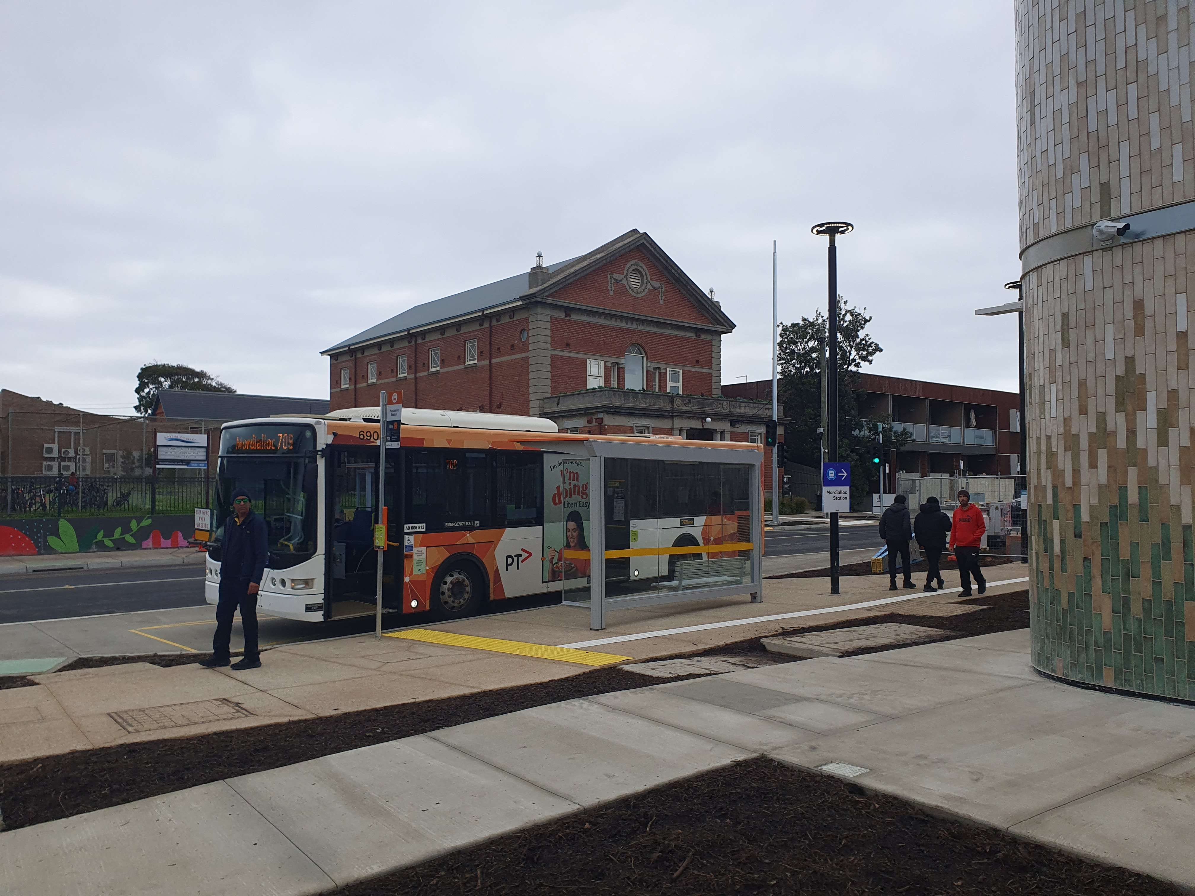
Of course, not all railway stations are equally significant interchanges. A handful of stations act as true interchange powerhouses, funnelling large volumes of passengers between modes, while many others serve only a few local routes. Below are the ten stations with the greatest number of connecting bus routes.
Melbourne’s Top Twenty Bus to Train Interchanges
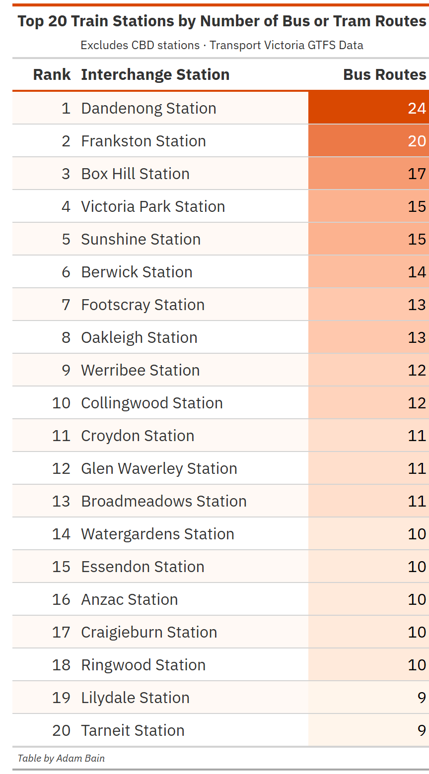
In the above table, I calculated the number of bus and tram routes within 200 metres of each railway station
At the top of the list is Dandenong, with its massive interchange of 24 different bus routes. Second is Frankston with 20 and Box Hill is third with 17. These three stations are longstanding suburban hubs, each being the most prominent stations on each of their lines respectively.


You may have noticed I included trams in this count. Why? We Melburnians are often loathed to admit it, but our tram system operates largely in mixed traffic, at relatively low speeds, with dense stop spacing. In every sense but the vehicle, we operate the trams like buses.
The critical problem with this list however is that the number of routes is not necessarily representative of number of services. So, I went ahead and calculated just that for the table below:
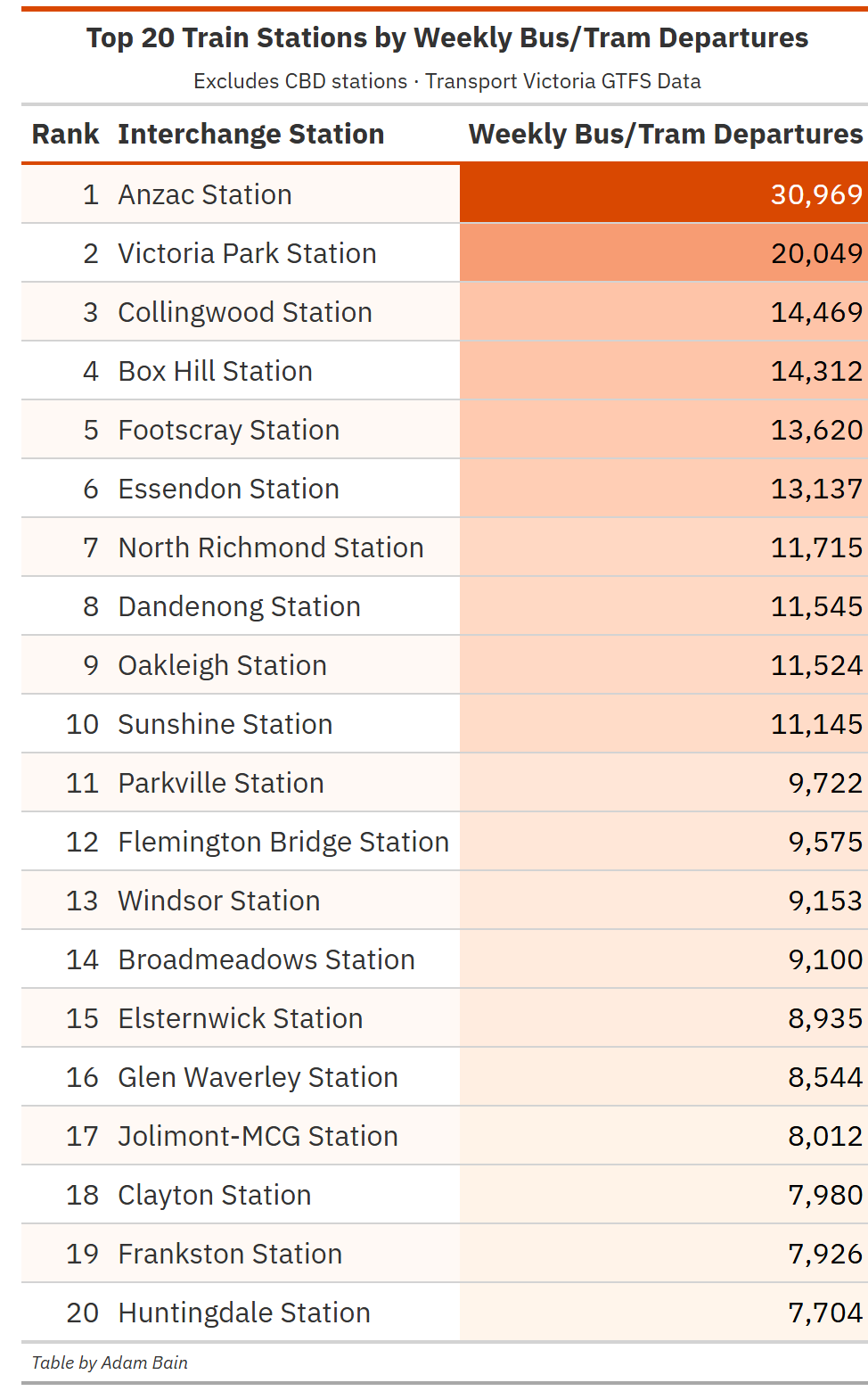
This is a radically different list – Dandenong and Frankston stations have fallen to 8th and 19th respectively, demonstrating why this is an important metric to investigate. Instead, the top of the list being led by the newly opened Anzac Station. This makes sense, Anzac Station sits on the busiest tram corridor in the world – and has 2 relatively frequent bus routes.
Second and third placed Victoria Park and Collingwood stations owe their positions parallel to the Hoddle Street bus corridor, hosting the 246 as well as a vast number of Eastern Freeway buses, including most notably 905 and 907. Victoria Park gets ahead due to perpendicular interchange with Johnston Street routes 200, 207 and 241.
Essendon notably scores highly, jumping all the way up to 6th. This is due to the 59 tram and 903, but also a series of other routes such as 477, 508 and 510, as well as the route 465 bus to East Keilor, which has a very strong peak timetable, some gaps between services being as low as three minutes.
A pattern in this list is the strong position of stations with trams, given not only the relatively high frequency of the trams, but also the long service hours that this higher frequency is given. 13th and 14th Windsor and Flemington Bridge Stations only have tram connections with no nearby bus routes.
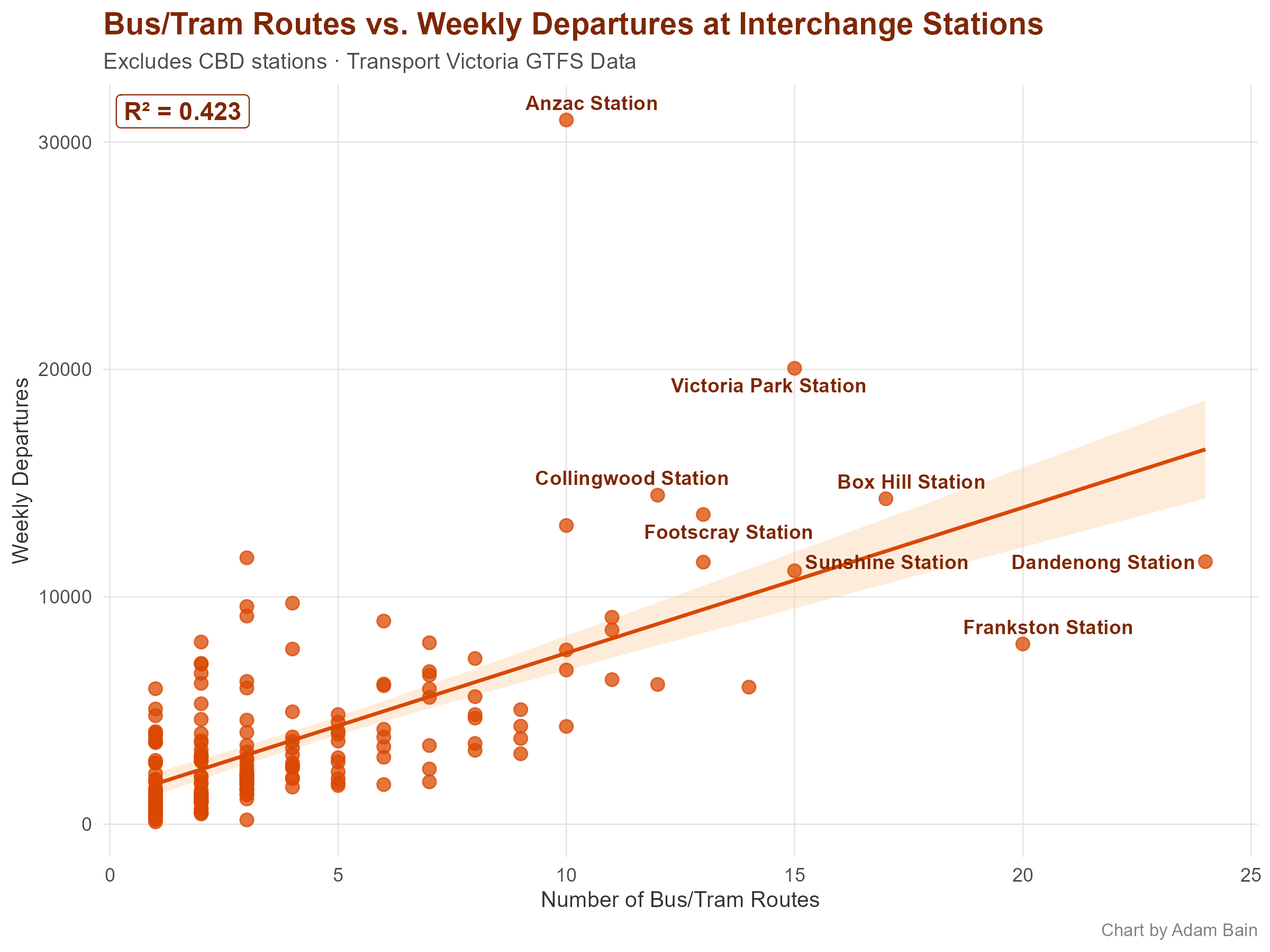
This chart plots the relationship between these two metrics. Once again, Dandenong and Frankston stand out – notably below the trend line. Despite having many bus routes, they don’t have a proportionate number of services. These areas have older bus networks which haven’t been significantly reformed for decades.
Is the Number of Bus Services Correlated with Station Patronage?
The next step is to ask if there is a relationship between the number of bus services and railway station patronage. I shifted my measurement to bus/tram arrivals rather than departures to better align with the DTP-provided station entries data set.
Note that as this is patronage data from the 2025 financial year, pre–Metro Tunnel, Arden, Anzac and Parkville are not included.
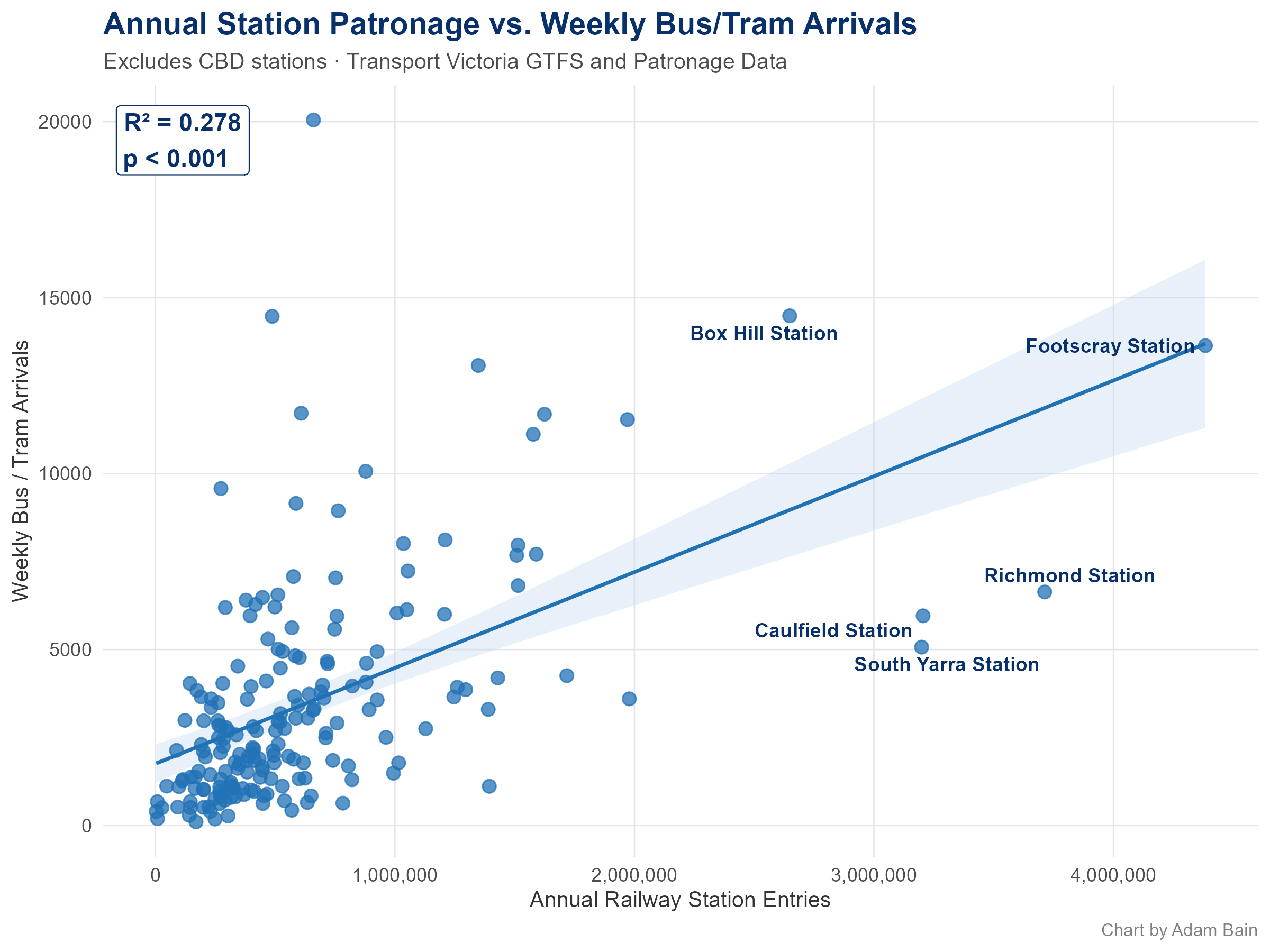
Whilst there is a statistically significant correlation, it is less explanatory than I anticipated, with a low R2 value of 0.278 – meaning that 27.8% of the variance in annual station entries can be predicted by weekly bus. This however is notably higher than the 17% of 2023 railway passengers that used a bus to access a station. I find it unlikely that since 2023 that number has dramatically increased given the limited scale of bus reform. So, what is going on?
The most plausible explanation is that bus and tram arrivals correlate with the kind of places stations are located in. High‑frequency interchanges are usually built in established activity centres – places with shops, jobs, services and dense housing. Those destinations generate rail trips regardless of whether passengers arrive by bus, by car or on foot. So, the relationship we’re seeing may be less about transfers and more about the fact that busy stations tend to sit in busy precincts.
How Bus Service Levels Change Through the Day
Earlier this year, I did a post where I took a look at how railway patronage changes over the course of the day. I depicted this with “clock charts”, such as this one for Hawkstowe, which had the heaviest weighting towards the AM peak.
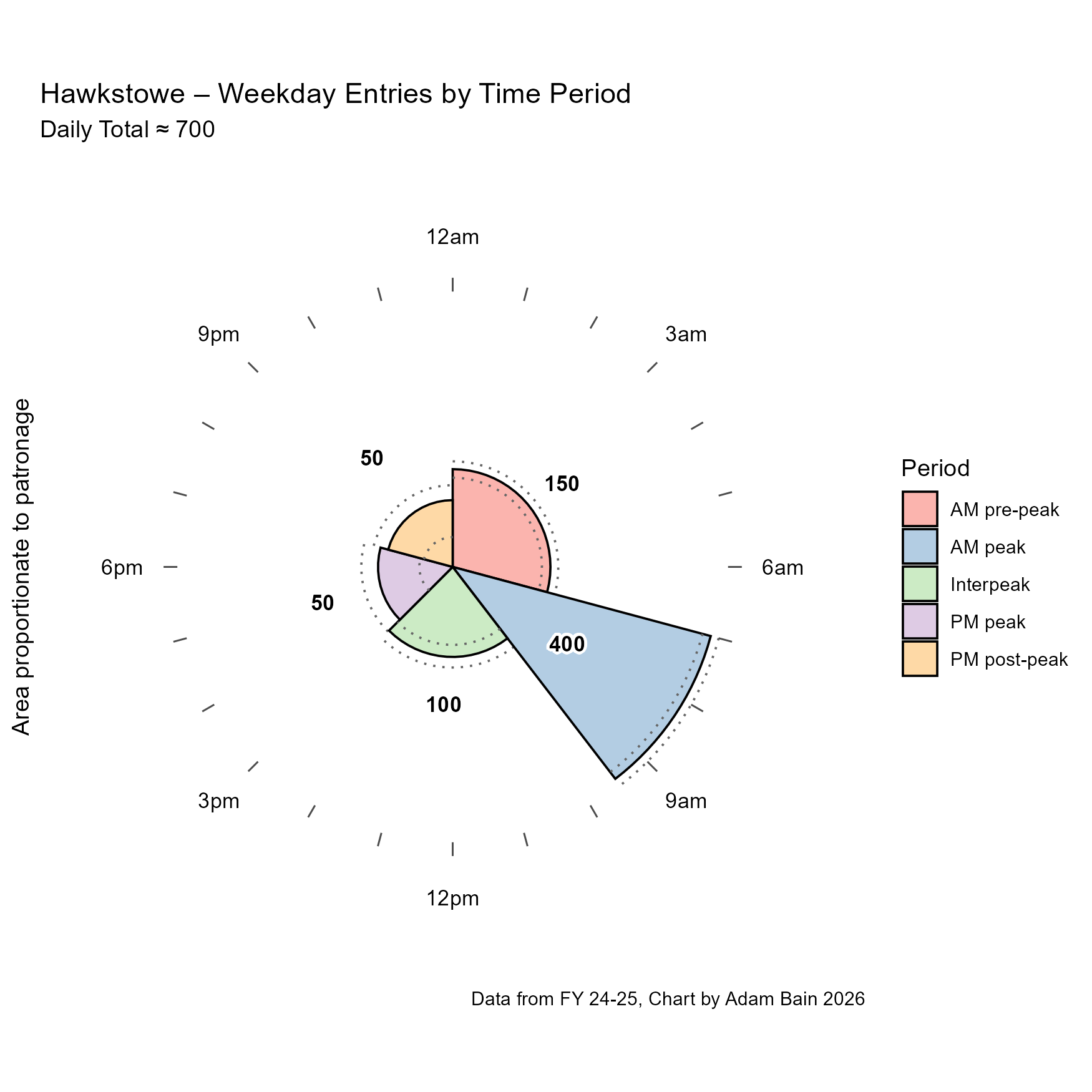
I decided to ask the same question of connecting bus services – which station has the most disproportionate AM Peak?
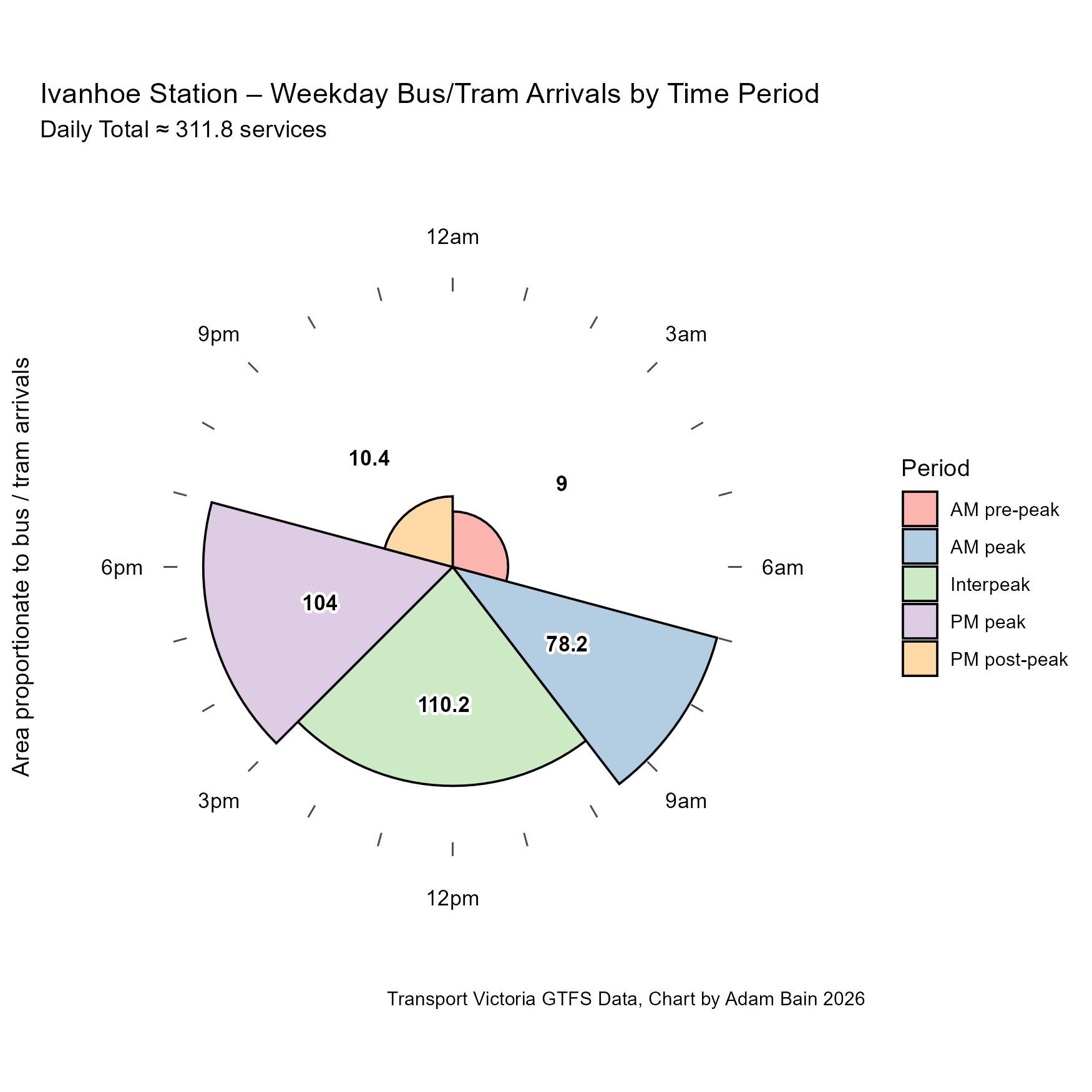
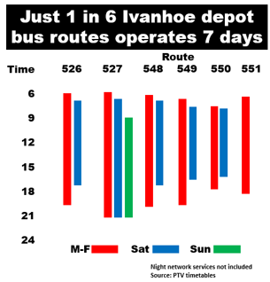
The winner here is Ivanhoe, perhaps not due to having a disproportionate number of peak feeder buses, but due to its rapid evening service collapse. Not only do routes in the Ivanhoe area, fall of quickly in the evening, but only one runs on Sundays at all – see this chart I took from Peter Parker’s blog on this specific issue.
When we compare the Ivanhoe bus clock chart to its patronage clock chart, even as it may be the “peakiest” station for bus connections, it is nowhere near as “peaky” as the station entries, with even provision across peak and interpeak.
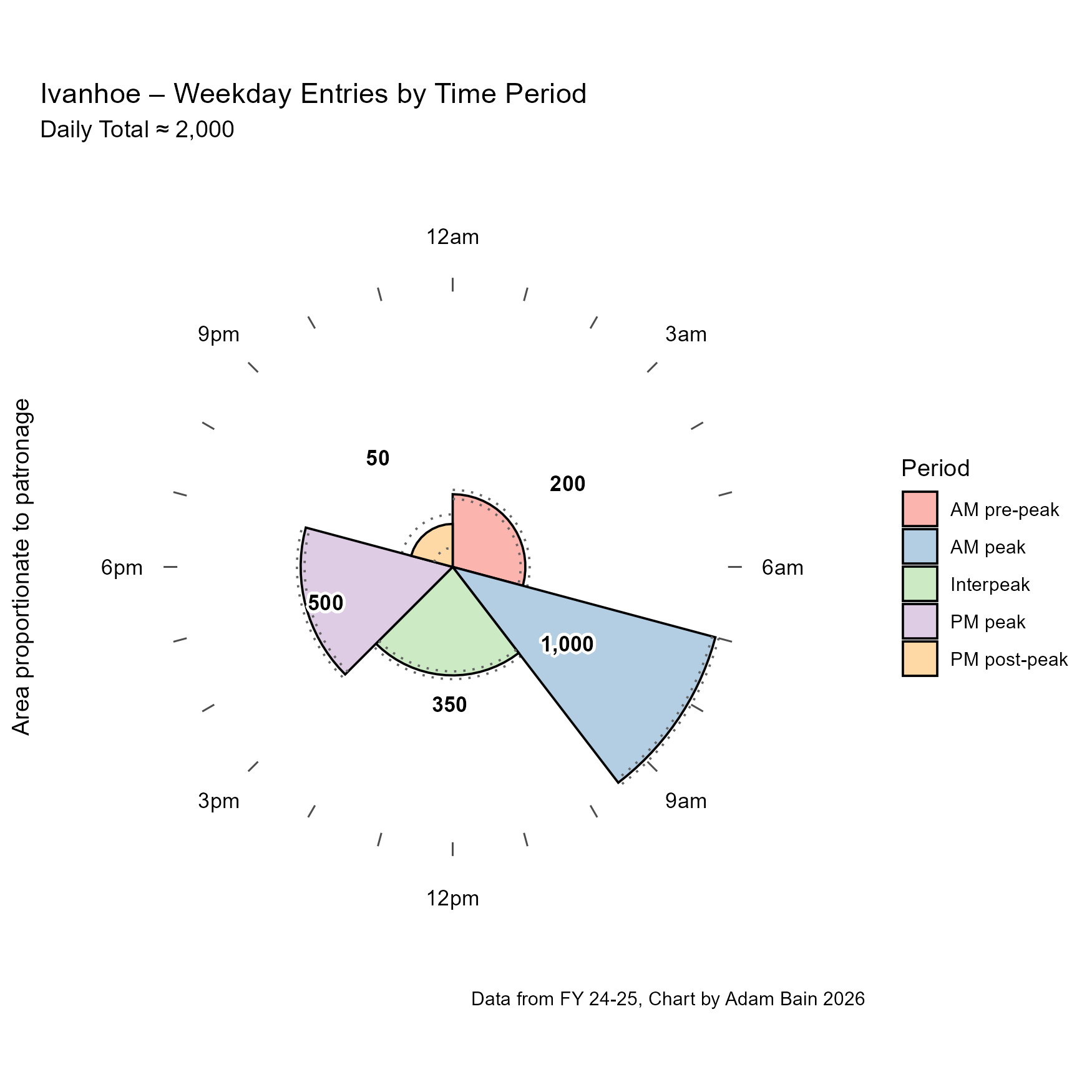
This pattern is replicated at almost every station across the network. You could argue this is due to both a shortfall in peak feeder capacity and an oversupply in the off‑peak. But minimum all‑day service is essential. If buses are going to function as real connective tissue in the network, they need to run frequently enough throughout the day – even when a strictly demand‑driven model would cut them back in the interpeak and evening.
Nonetheless, I think it’s interesting to look at where the time profiles for bus / tram arrivals deviates the most from the time profile of station entries.
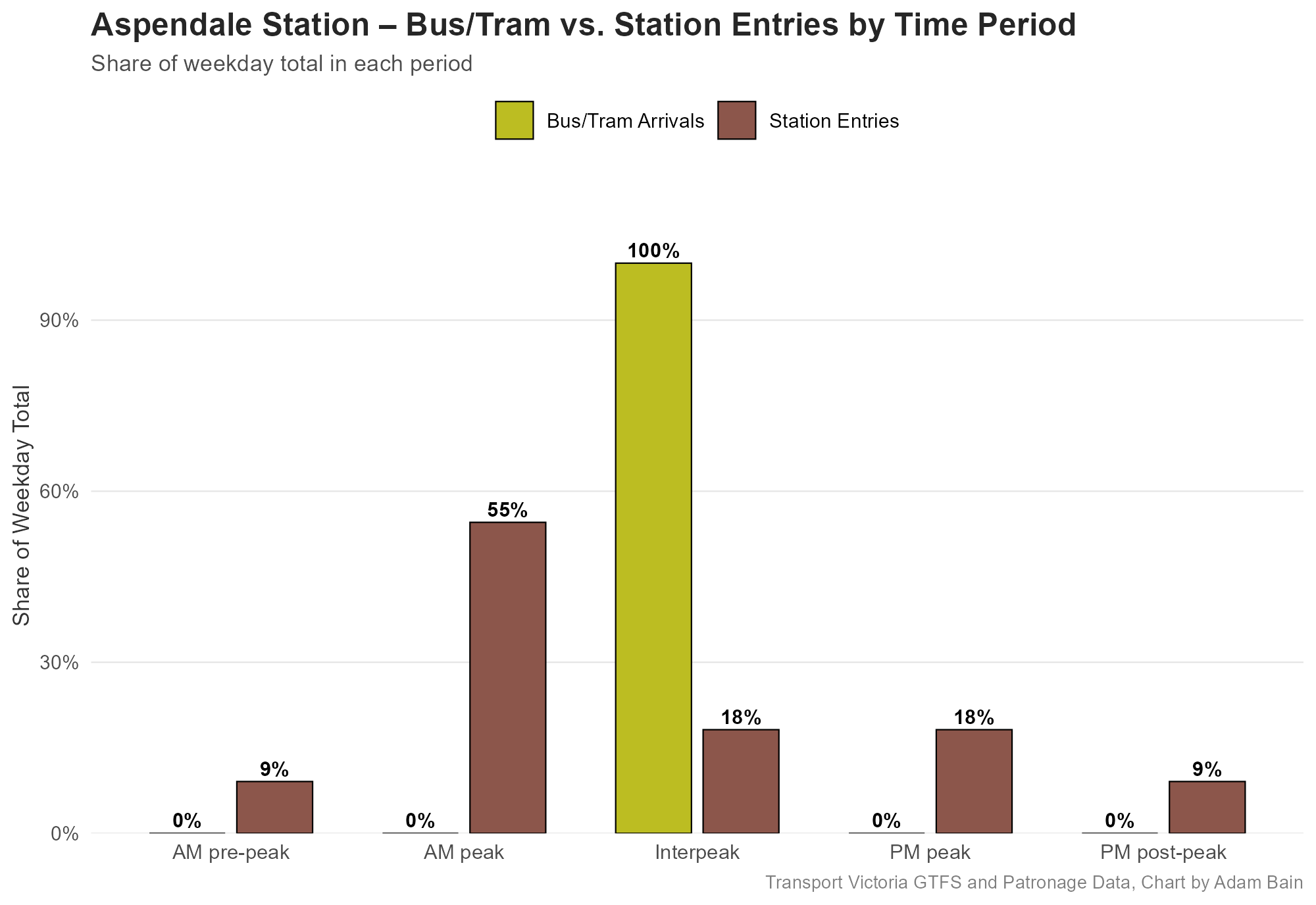
The winner for this category was Aspendale, a station with a quite proportionally large peak hour for passenger entries, likely due to the Frankston line express services making travel time competitive. But it has zero connecting peak bus services – the only bus service in Aspendale is the off peak only, three times a day 706.
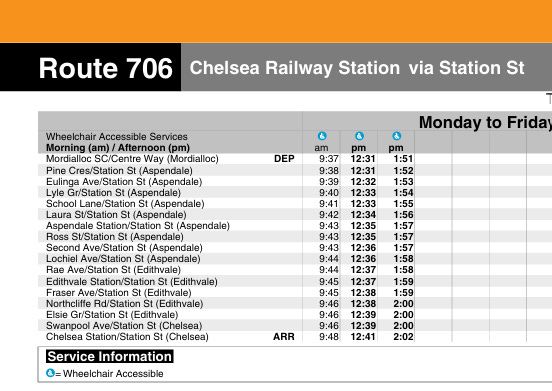
Due to the geography of Aspendale, I don’t think it’s worth adding any peak bus services – all plausible feeder routes are better off connecting to the Frankston line at Mordialloc or Edithvale. However, the next most deviant station – Merinda Park is a different story.
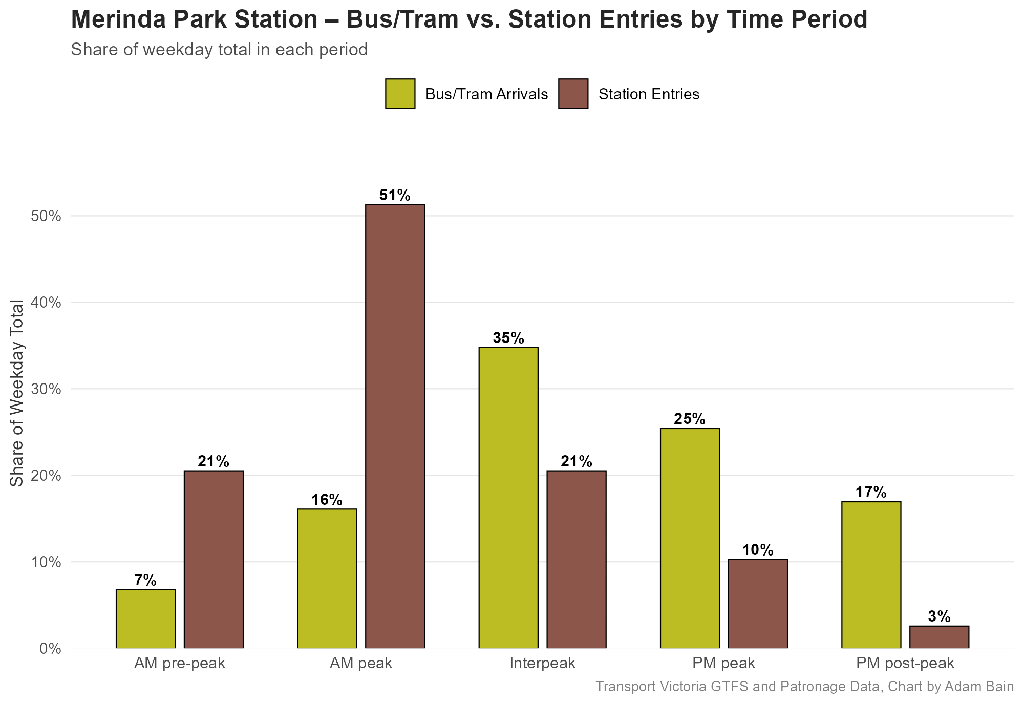
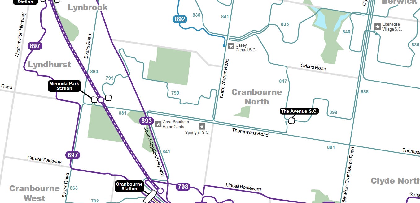
Merinda Park is hugely busy during AM peak, even has a large AM pre-peak (before 7am). This is due to its rapidly growing professional commuting population, and its distance from the city, incentivising getting to the station early. However, none of the connecting buses have supplementary peak runs. Whilst I generally advocate for getting all-day frequency up to a passable quality, this is a case where I think we would not do bad to fund some extra peak and pre-peak bus services.
What about Non-Train Station Bus Interchanges
Throughout this post we have discussed bus interchanges that happen to also be train stations, but there are some bus interchanges that are not train stations, so I decided to have a look at them too and see how they stack up.
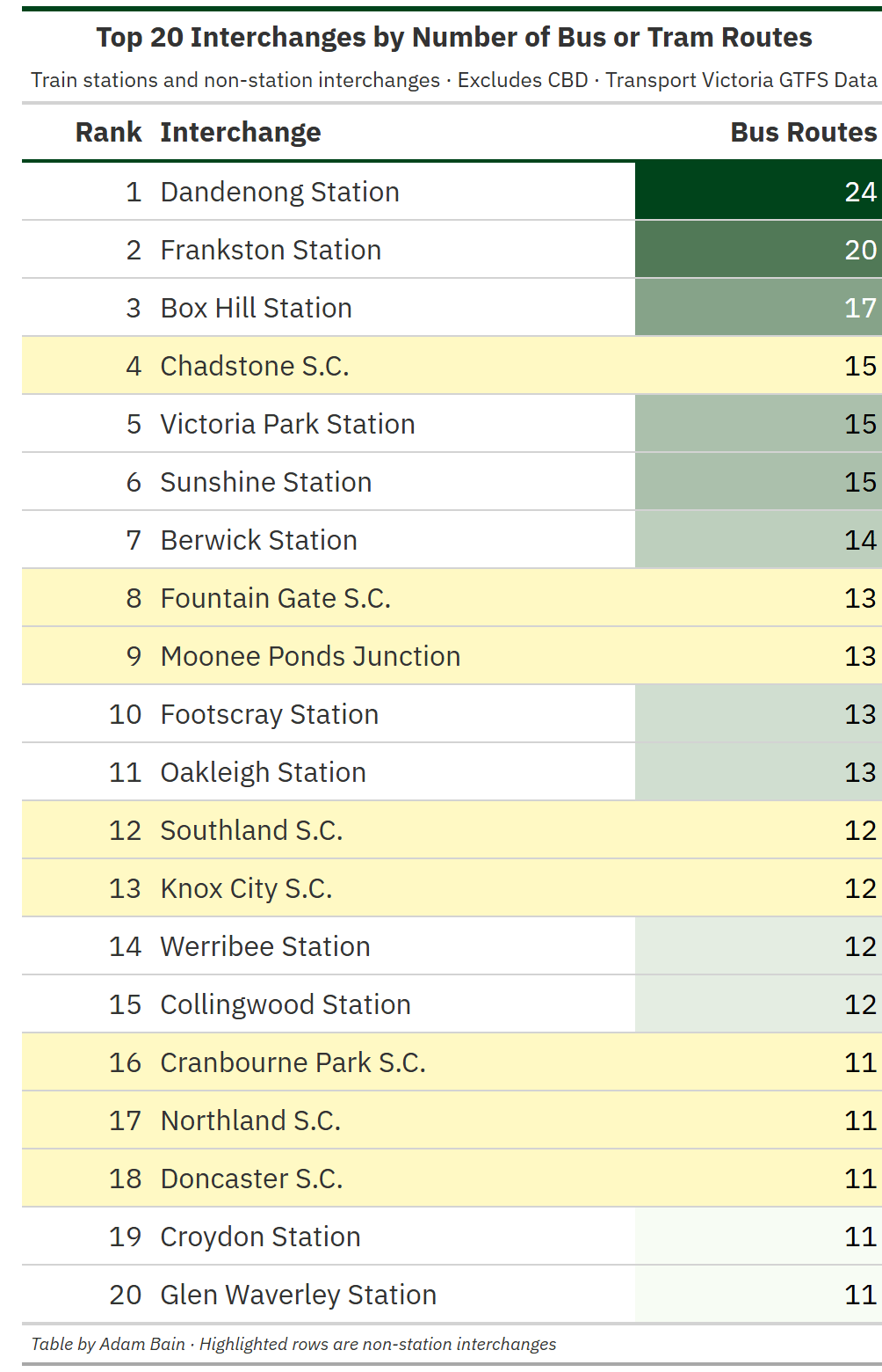
I have highlighted non-train stations, and perhaps unsurprisingly the new additions to this top 20 list are mostly large shopping centres. Indeed, Chadstone Shopping Centre and Fountain Gate Shopping Centres are the 1st and 2nd largest indoor shopping centres in Australia, so it’s good that a lot of routes go there.
Moonee Ponds Junction is interesting, as it is not at a major shopping centre, but the long-established Moonee Ponds suburban town centre, albeit far from the railway station. Still, you can interchange to trams 59 and 82.

When we take a look at weekly services instead, Monash University shoots up from not on the list to 5th place. This is testament to the frequency of the 601 shuttles, but also the other routes such as SmartBuses 900 and 703. As a Monash Uni student, I can attest that the bus interchange is always busy.
On the other hand, Fountain Gate S.C. has fallen off this list, making it perhaps the “Frankston Station of non-railway bus interchanges”. Whilst It has many routes, none of them are frequent – in fact the most frequent route that visits Australia’s 2nd biggest shopping centre – 828 – runs only every 20 minutes, falling to a shocking hourly service on Sunday.
Concluding Thoughts
Measuring interchange quality purely by the number of routes tells only so much – frequency ultimately determines whether transferring is convenient enough to compete with driving. Melbourne has several genuinely decent interchanges, but it also has many locations where a convergence of many routes disguises an infrequent network. If Victoria wants buses to function as effective feeders to rail, improving all-day frequency, even in areas that are already thought of as “served” is critical.
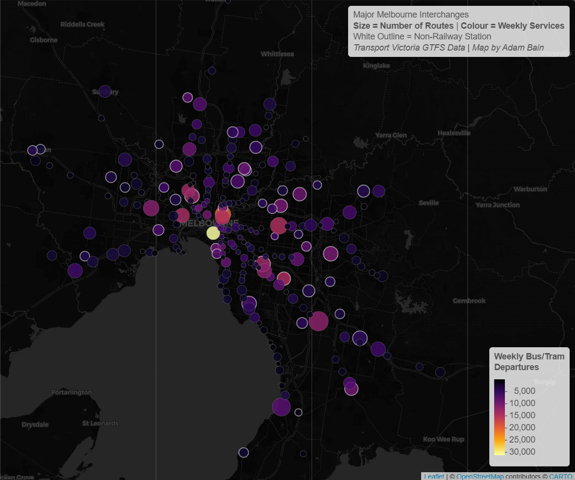
For a special treat – here is an interactive map of much of the data discussed in this post: Link to map
Thanks for reading 😊